Building a Brand Identity for Your Record Label: A Step-by-Step Guide for Independents
Most independent label founders spend months finding the right artists and zero time figuring out what their label actually stands for. That's backwards. Before you pitch to distributors, post on social media, or sign your first act, you need a clear answer to one question: what does this label mean? Brand identity is the answer — and getting it right early saves you from rebuilding everything later.
What Brand Identity Actually Means for a Record Label
A record label's brand identity is the sum of how it looks, sounds, communicates, and makes people feel — across every interaction, from a social media post to a vinyl sleeve. It's not just a logo. It's reputation made visible and consistent.
In the independent music industry, brand identity carries even more weight than it does for major labels. You don't have a decades-long catalog or a corporate PR team to establish credibility for you. What you have is perception — and perception is built deliberately or accidentally. Doing it deliberately is always better.
Think of brand identity as the connective tissue between your label's values, your artist roster, and your audience. When all three align, fans and industry contacts recognize your label instantly, even before they see your name. That kind of recognition translates into trust, and trust converts into streams, ticket sales, and licensing deals.
Start With Your Label's Mission and Values
Your label's mission statement is the foundation everything else is built on. Before touching a design tool, write down — in plain language — why this label exists, what genre or cultural space it serves, and what kind of artists and listeners you want to attract.
This isn't a corporate exercise. It's a filter. A label rooted in underground electronic music will make completely different decisions about tone, imagery, and artist selection than one focused on Americana or gospel. Your mission keeps those decisions consistent.
Ask yourself three questions:
- What gap in the music landscape does this label fill?
- What values do you want every release to carry — raw authenticity, technical precision, cultural activism?
- Who is the audience, and what do they already care about?
The answers don't need to be polished. They need to be honest. A one-paragraph mission statement that actually reflects your vision will do more for your branding than a beautifully worded statement that means nothing in practice.
Define Your Visual Identity
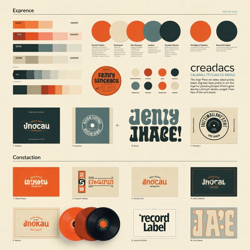
Your visual identity — logo, color palette, typography, and imagery style — should feel like an extension of your genre and personality, not a generic music industry template. These elements work together to create immediate recognition across every platform and format.
Start with your logo. It needs to work at multiple sizes: a favicon on a browser tab, a profile picture on Instagram, and a full bleed on a merchandise hoodie. Simple, scalable, and distinctive beats complicated every time. A jazz-focused label might lean into clean, minimalist typography with muted tones. A metal label might favor aggressive lettering and high-contrast black and white. Neither is right or wrong — what matters is that the choice reflects the actual music.
Your color palette should be limited to two or three primary colors, with one or two accent tones. More than that creates visual noise. Typography follows the same logic: pick one or two typefaces and use them consistently across everything — press releases, social graphics, packaging, and your website.
Imagery style is often overlooked but equally important. Decide early whether your label's aesthetic leans toward high-contrast photography, grainy film textures, illustration, or something else entirely. That visual language should carry through every album cover, promotional photo, and social post.
Develop a Consistent Brand Voice
Brand voice is how your label sounds in writing — and it matters as much as how it looks. The tone you use in a press release, an Instagram caption, or an artist bio tells people who you are just as clearly as your logo does.
Start by defining a few adjectives that describe how you want to communicate. Direct and irreverent? Thoughtful and literary? Energetic and community-driven? Write those down and use them as a reference every time someone on your team creates written content.
Consistency is the key metric here. A label that sounds like a corporate newsletter on its website but uses slang-heavy captions on social media feels fragmented. That inconsistency erodes trust subtly but steadily. Audiences pick up on it even when they can't name what's off.
Your brand voice should also extend to how you talk about your artists. The language you use in bios and announcements signals the kind of label you are — one that respects its artists' artistry, one that leads with numbers and streaming stats, or one that foregrounds cultural context. None of these is wrong, but the choice should be deliberate and consistent.
Align Your Brand With Your Artist Roster
Your artist roster is a direct reflection of your label's identity — and misalignment between the two is one of the most common branding mistakes independent labels make. Signing artists who don't fit your established aesthetic or values creates confusion for fans and industry contacts alike.
This doesn't mean every artist needs to sound identical. It means there should be a coherent thread connecting them — a shared aesthetic sensibility, a cultural moment, or a genre ecosystem. Sub Pop built a reputation around a specific Pacific Northwest sound and attitude. That curatorial consistency made the label itself a discovery tool: fans trusted that anything on the roster was worth listening to.
The label's identity should complement the artist's personal brand, not compete with it. A strong label brand creates context and credibility without overshadowing the individual. When you sign someone, ask: does this artist make sense in the same conversation as our other releases? If the answer requires too much explanation, that's a signal worth heeding.
Show Up Consistently Across Every Touchpoint
Brand identity only works if it's applied everywhere, not just on your website. Every channel where your label appears — social media profiles, email newsletters, physical packaging, merchandise, and live events — is an opportunity to reinforce or undermine your brand.
Audit your current touchpoints against your visual and voice guidelines. Do your Instagram graphics use the same typefaces as your website? Does your email tone match your press releases? Is your logo reproduced correctly on merchandise, or has it been stretched or recolored by a printer?
Small inconsistencies accumulate. A fan who encounters your label across multiple platforms should feel the same thing each time — a sense of recognition that builds familiarity and, eventually, loyalty. That's how brand recognition actually develops: not from a single great design, but from hundreds of consistent small interactions over time.
Live events and physical products deserve particular attention. A well-designed record sleeve or a cohesive merch table at a show leaves a lasting impression that no amount of digital content can fully replicate. These tangible touchpoints often create the strongest emotional connections with your audience.
Evolve Your Brand Without Losing Its Core
Brand identity isn't static, and treating it like it is will eventually make your label feel dated. As you grow, sign new artists, or respond to shifts in the music landscape, your brand will need to evolve — but evolution is different from abandonment.
The goal is to refresh the surface while preserving the core. You might update your logo, shift your color palette slightly, or adopt a new tone for a new platform — but the underlying values and visual logic should remain recognizable to anyone who's followed you from the beginning. Think of it less like a rebrand and more like a wardrobe update: the person wearing the clothes is the same.
Before making any significant brand change, ask what you'd be losing. If longtime fans and industry contacts associate specific visual or tonal elements with your label, those elements have equity. Changing them has a real cost, even if the new direction is objectively stronger. Evolve with intention, not just because something feels stale.
Frequently Asked Questions
How is a record label's brand identity different from an artist's personal brand?
A label's brand identity represents the organization — its curatorial vision, values, and roster as a whole. An artist's personal brand represents the individual's creative persona. The two should complement each other: the label provides context and credibility, while the artist provides the human connection. Conflict between the two usually signals a signing that wasn't the right fit to begin with.
Do I need to hire a designer to build a professional label identity?
Not necessarily, but the quality of your visual identity matters. If you have a genuine eye for design and understand the principles of typography and color, you can build something credible with the right tools. If you don't, investing in even a single session with a freelance designer for your logo and core visual guidelines will pay dividends for years. A poor logo is harder to recover from than most founders expect.
How long does it take to build a recognizable record label brand?
Recognition is built through repetition over time — realistically, 18 to 36 months of consistent output before a significant portion of your target audience starts to recognize your label on sight. There are no shortcuts. What you can control is the quality and consistency of every touchpoint during that period.
Can a small or one-person label still have a strong brand identity?
Absolutely. Some of the most distinctive independent labels are run by one or two people. Size doesn't determine brand strength — consistency and clarity do. A one-person operation with a sharp visual identity, a clear mission, and a coherent roster will outperform a larger label that treats branding as an afterthought.
What's the biggest branding mistake independent labels make?
Starting with visuals before establishing values. Founders often jump straight to logo design without first answering why the label exists, who it's for, and what it stands for. The result is a logo that looks fine in isolation but doesn't connect to anything deeper — which means it can't do the work a real brand identity is supposed to do.